Switching Yello’s product team to Figma
When I joined Yello, the designers and product teams were using Sketch files synced to Google Drive for designs, InVision for prototyping, and other tools and manual processes to keep everyone in sync. It worked, but there was a better solution.
Having used Figma for at least a year before this point, I knew it had a robust way of managing components and creating prototypes, and believed that it would be relatively easy to switch a small team over to.
Goals
- Reduce friction between designers, PMs and engineers with Figma's commenting and live Jira embed features
- Reduce time from design to prototype by eliminating the need to use InVision
- Increase designer collaboration with multiplayer (more than one designer can work in the same file at the same time) and observation mode (you can click on someone's avatar to see what they're viewing/designing)
At the time, these were a few of Yello's high-level design and process needs and how they were met before and after the switch.
Process
Because the team was already deep into Sketch and InVision, to make it easier for others to explore the tool for new design work, I recreated the majority of the team’s existing Sketch components in Figma. These included modals, toasts, flyouts, colors, buttons, tooltips, tables, navigation, icons, form elements, UI controls, tags, empty states, and typography.
I also added thumbnail status preview cards that made it a little easier to find files and communicate status (but is still a WIP).
The process for switching over took about 6 months for all 4 teams, and also involved creating workshops for PMs, engineers and designers to learn the tool through on-hands projects, and writing resources on Confluence.
I also sent a survey asking PMs, engineers, and designers for feedback on the tool.
Learnings
- Not as many engineers as I thought were leaving comments in files
- Some people wanted wireframe components in addition to the high-fidelity ones we had
- The tool's role in improving collaboration was perceived differently across teams
Based on actionable feedback from the survey, I designed and added wireframe components to our team library, held an engineer-tailored workshop, and created a #figma-questions channel on Slack where everyone could continue to learn asynchronously, and from each other.
Reflecting on my 1st year at @Yello, my fav project wasn't working on new features. It was actually driving the switch from Sketch/Invision to @figmadesign, teaching 40 PMs, designers, and engineers along the way how to better collaborate. For that, I got the award "Figmatic" 🙃 pic.twitter.com/nHEbRPHeVg
— Trucy Phan (@trucy) December 13, 2018
Although this wasn't straight up product design, it has been one of my most favorite accomplishments working at Yello.
Unifying Yello's UI
Inheriting a limited color palette that was inaccessible and lacking the range for various design needs, I took an opportunity to work on creating a new color palette.
Problems:
- Most color combinations failed WCAG AA standards
- Hues at the same level based on the naming convention were different levels of darkness, so applying them in a systematic way was difficult
- There were too few colors to use for all our visual needs (information hierarchy, user focus, small details, hover effects, etc.)
- The colors had no guidelines for usage, which led to inconsistent application (e.g. two primary colors of green and blue were being used arbitrarily for CTAs)
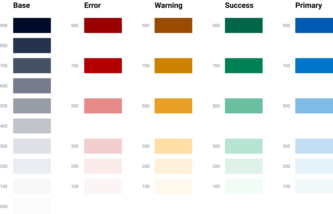
Yello's old color system
Yello's old color system failed most accessibility contrast ratios
Process
- Audit our component library and the product to see what our needs were
- Research other design systems’ color palettes -- number of unique hues per color, naming convention, etc.
- Stress test by applying colors to components and views
- Solicit feedback from designers and engineers
- Add colors to Figma library so other designers can use
- Iterate based on feedback from designers
Goals
- Achieve WCAG Level AA text contrast
- Create guidelines for consistent, intentional uses of color
- Be able to apply colors in the system to backgrounds, borders, shadows, hover states, etc. without needing to create additional hues
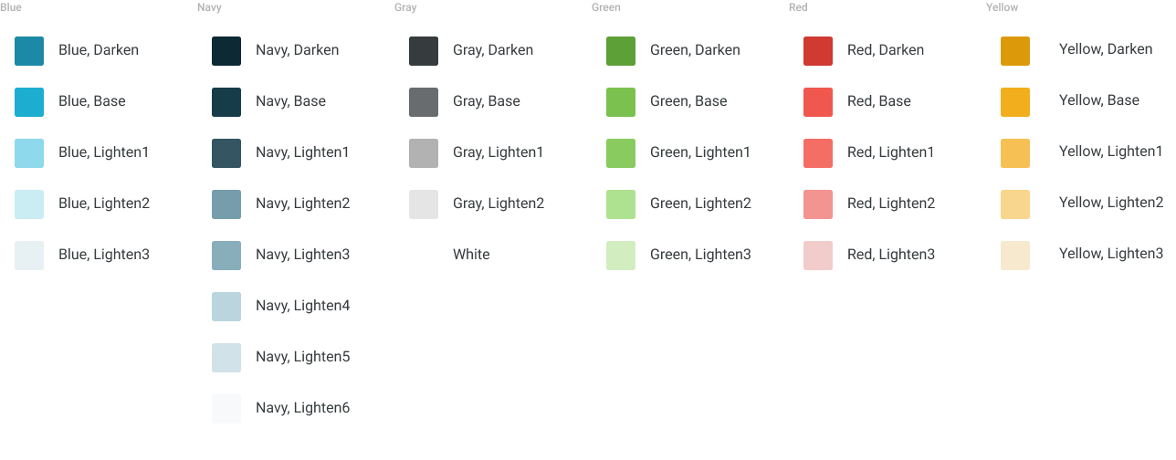
Yello's new color system
Learnings
- Some colors looked fine at their darkest shade, but when I made them lighter, they began to take on hues of another color. I had to manually adjust RGB values on many colors in the set above.
- Some color combinations initially looked fine, but their contrast ratios were far from AA. The reverse was also true; color combinations that were difficult to read could also pass AA.
- Not all hues are equal (hues of yellow are really hard to make accessible!)
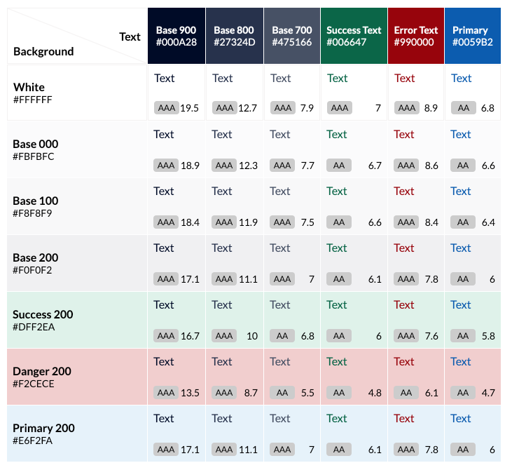
Accessibility
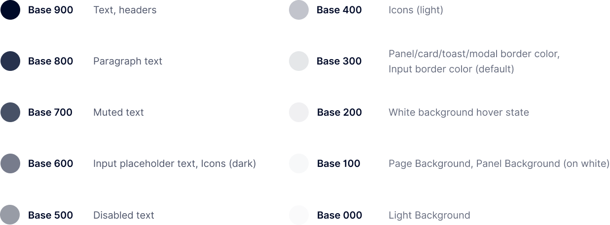
I designed the colors to work as text, backgrounds, buttons, hover states, border colors, and more. I thought in pairs and in sets, and aimed to make it accessible but still expressive. Every 900/800/700 level of each color is designed to be AA accessible on four different backgrounds: White, Base 000, Base 100, and Base 200.
Designer Usage
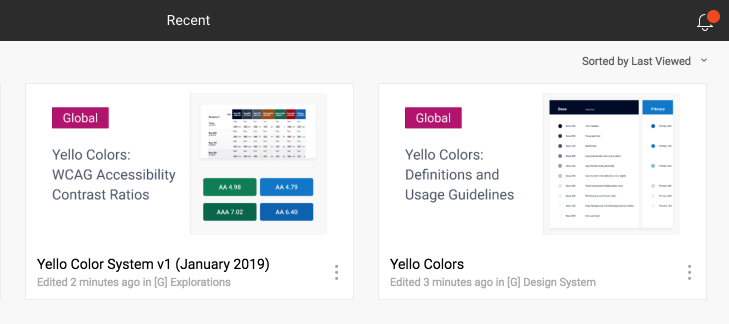
To achieve the goal of having designers consistently apply colors as intended, I added descriptions to each style in Figma that shows up on hover.

I also wrote a usage guide for each hue, and included an example from our library file below.
Color Usage Guide
Here are a few examples of components with my color system applied.
A set of core UI components
Event Management (WIP)
Note: this case study is currently being written (as I'm still working on it!).
Background
In order to meet and encourage candidates to apply to jobs, recruiters often attend professional and university events. These include career fairs, information sessions, and virtual events.
Before an event begins, a recruiting team often has to consider registering for the event, inviting candidates to pre-register for the event, and inviting staff members to RSVP if they can attend.
Preceeding all of this, however, is the event creation itself in Yello.
Although it mostly worked, initial feedback from users and customer support on event creation was that it had too many steps, was confusing, and was ugly.
Research
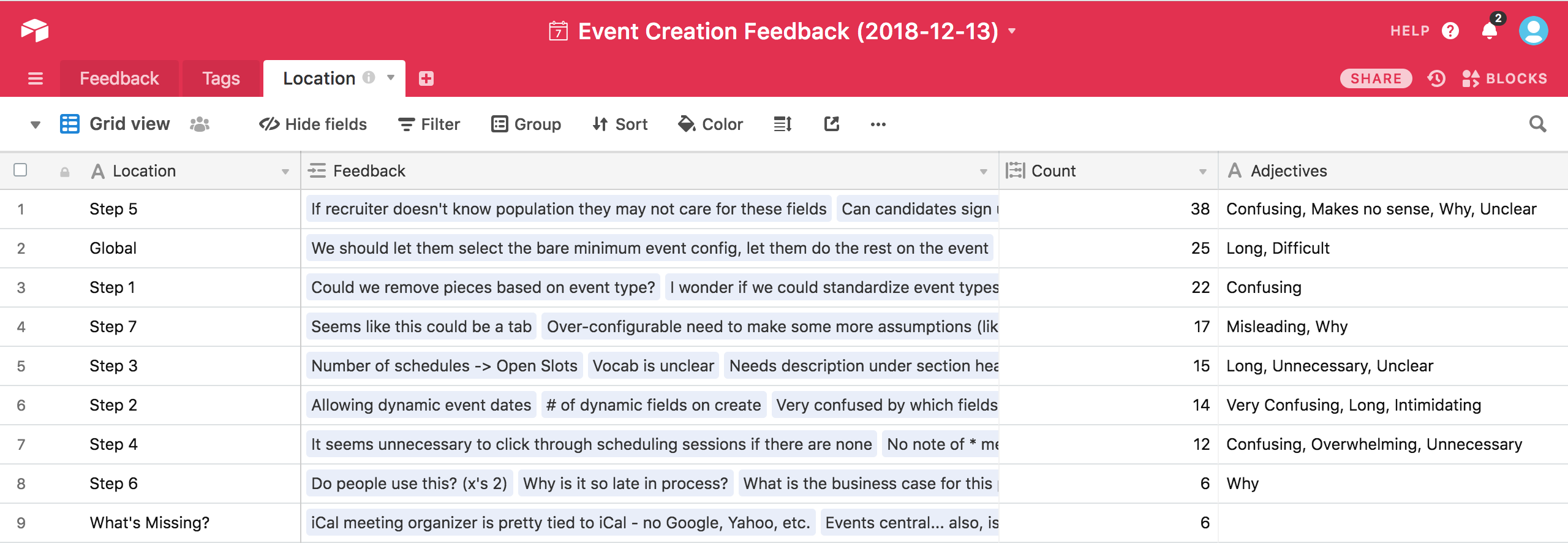
Before I worked on the information architecture of event creation, our team conducted a meeting with engineering, product, customer support, and design stakeholders and went through each of the 7 steps required to create an event in Yello.
Everyone was given post-it notes to write down questions, opinions, concerns, and any other feedback. I used Airtable to organize 143 pieces of feedback by location (which step, or if it was global, or if it was missing) and category (e.g. information architecture, copy improvements, ui and visual design).
In addition to internal feedback, I held user interviews to talk to clients about event management. Through those chats, I understood the different types of roles who create and view events, learned what event information and metrics are important and valuable for recruiters, and heard various pain points about the creation and management process.
For example, the following user flow below (please click to open in a new tab, as it's super wide!) shows how long and confusing it was: dozens of fields spread across 7 tabs, UI elements that only appeared once you selected a checkbox or radio button, and information that users just didn't need. Also, since there was no save as draft feature, users often lost their information if they closed the tab, or accidentally went "back" in their browser.
Event Creation Flow (Old)
Simplification of Information Architecture
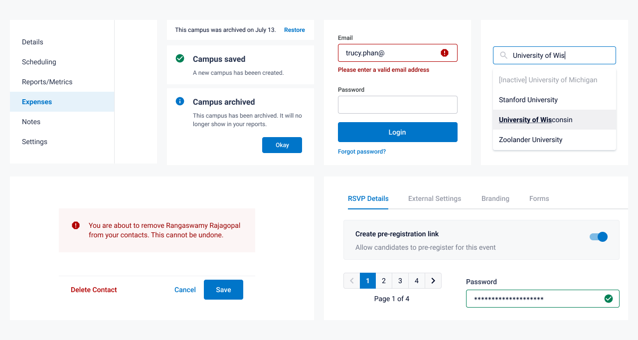
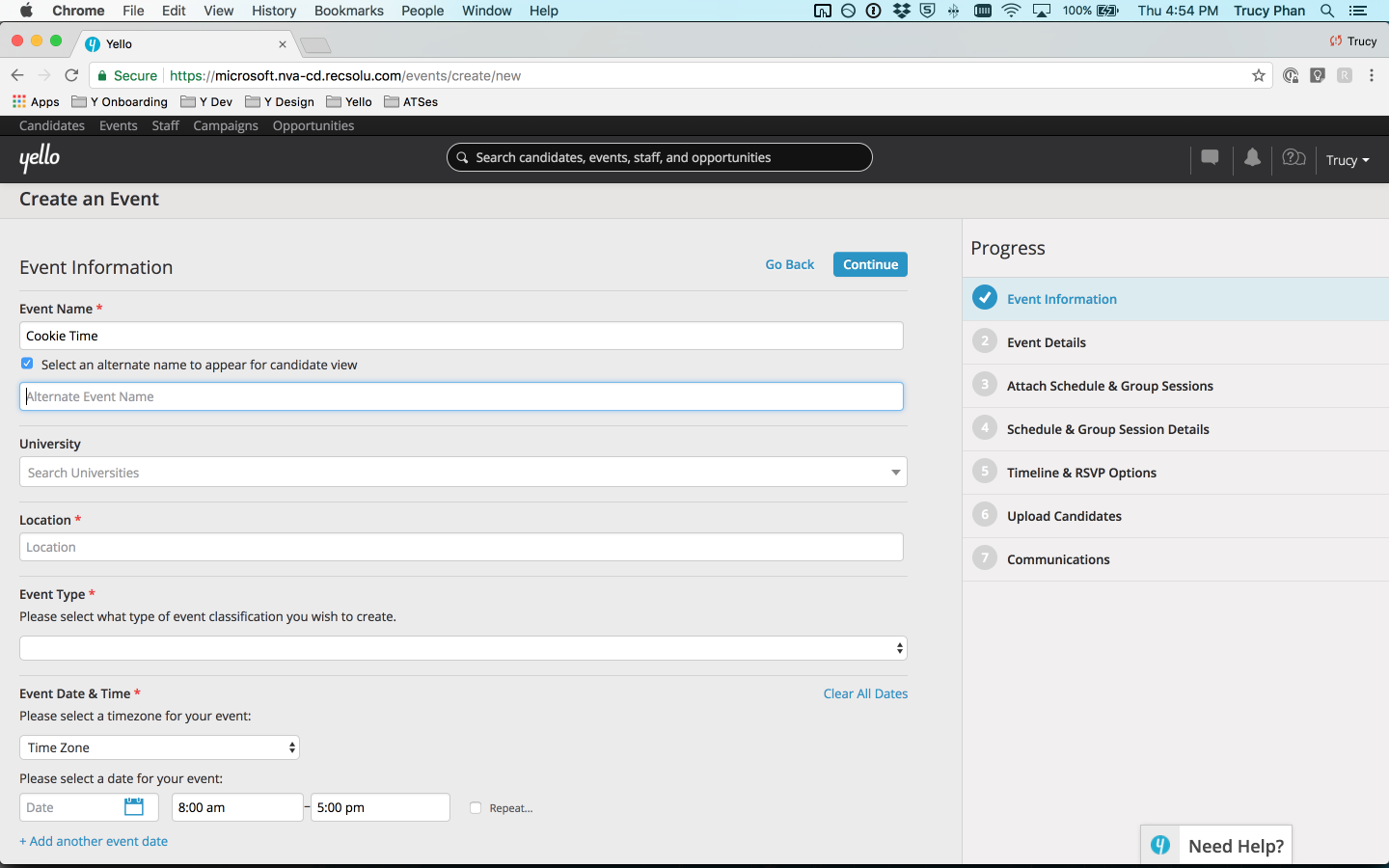
Using updated form elements I designed and adding sections to create breathing room, I stripped down event creation from 7 steps to one.
However, that meant that a lot of information that was previously available to a user in event creation needed a new home, which meant event pages needed an information re-architecture as well.
I started by creating a "Settings" tab, which previously didn't exist on Event pages.
Event Creation Old vs. New Information Architecture
Event Settings
Still writing this case study... to be continued with more about process, screenshots, and prototypes :)