Improving Funnel Optimization and Cart Conversion
Goal
- Increase conversion from homepage → product page → add to cart → checkout
Process
- Understand customer journey
- Improve information architecture
- Take new product photos, elevate visual design of site
- Redesign and rebuild website
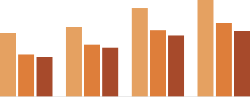
There are no numbers on the charts below, but they are based off actual conversion numbers for people who added something to their cart, checked out, and completed a purchase during the last 4 months I worked at Ample.
Add to cart → Checkout → Purchase %
Understanding why people drink meal replacements
When I joined Ample, I'd never considered consuming a meal replacement because I love food. I also didn't care about what macronutrient ratios were entering my body, and while working at Ample some weeks I ate donuts daily (eep).
Before I could even start improving the site converstion, I had to understand what Ample customers were asking, thinking, raving, and complaining about.
Me, dogfooding people food
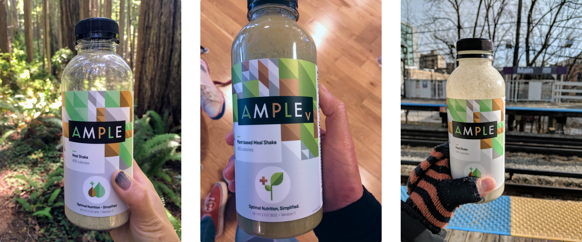
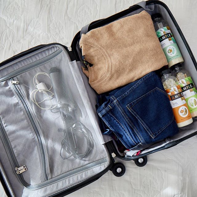
So I tried it with water. I tried it with milk. I refrigerated it. I mixed it with coffee and water. I tried competitors' products in various forms and flavors. I gave it to friends and asked for feedback. I had it for breakfast, lunch, dinner, and divided it in two as smaller snacks. I took it on the bus, drank it on hikes, passed it through airport security, and drank it in pottery class.
In addition to my own experiences, I was lucky to have a wealth of quantitative and qualitative information to work with, which I drank up as well (pun intended).
Data Sources
Measuring success
During the time I was updating the website and monitoring conversion rates, the following things stayed constant:
- Creative ads running
- Audiences targeted
- Product line
What changed?
In addition to hiring a new customer service rep (which allowed more customers' questions to be answered faster), everyone honestly probably all got relatively better at their jobs over time.
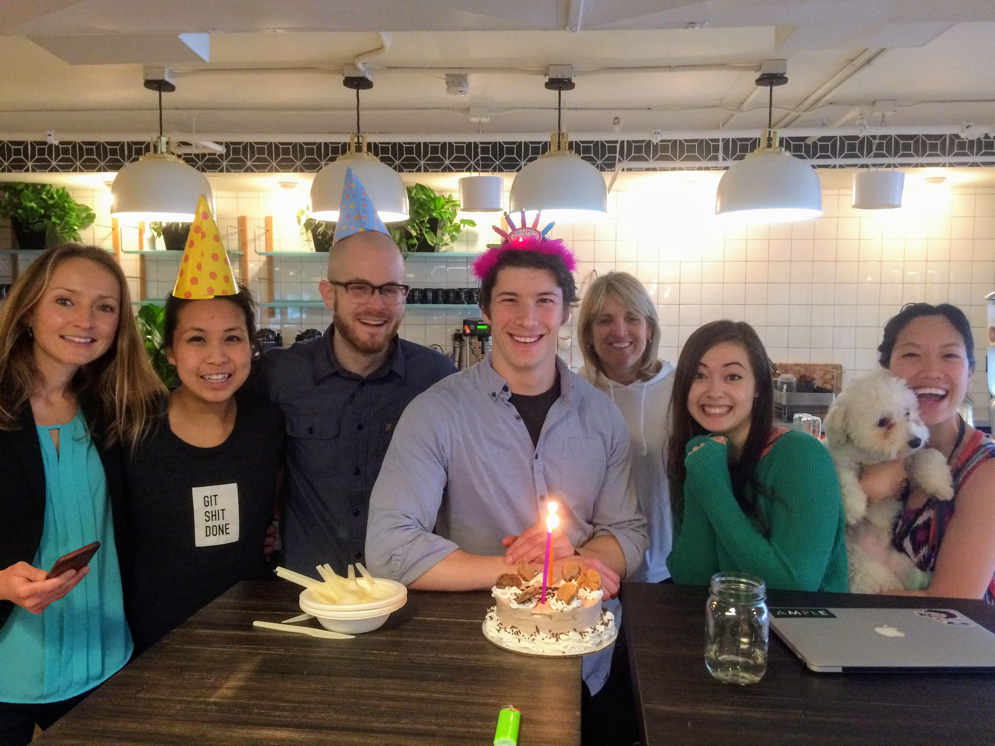
Although IMO the success of the product is attributed to the hard work of everyone above (+ a couple more who got hired later) who was part of the ride, this is, after all, my portfolio. Here's what changed design-wise, with screenshots and more detail below.
- Updated information architecture
- Worked with a product photographer for new shots
- Added ability to subscribe
- Switched to a more readable font
- Improved overall whitespace
- Improved mobile web design and spacing
Visual Design Changes
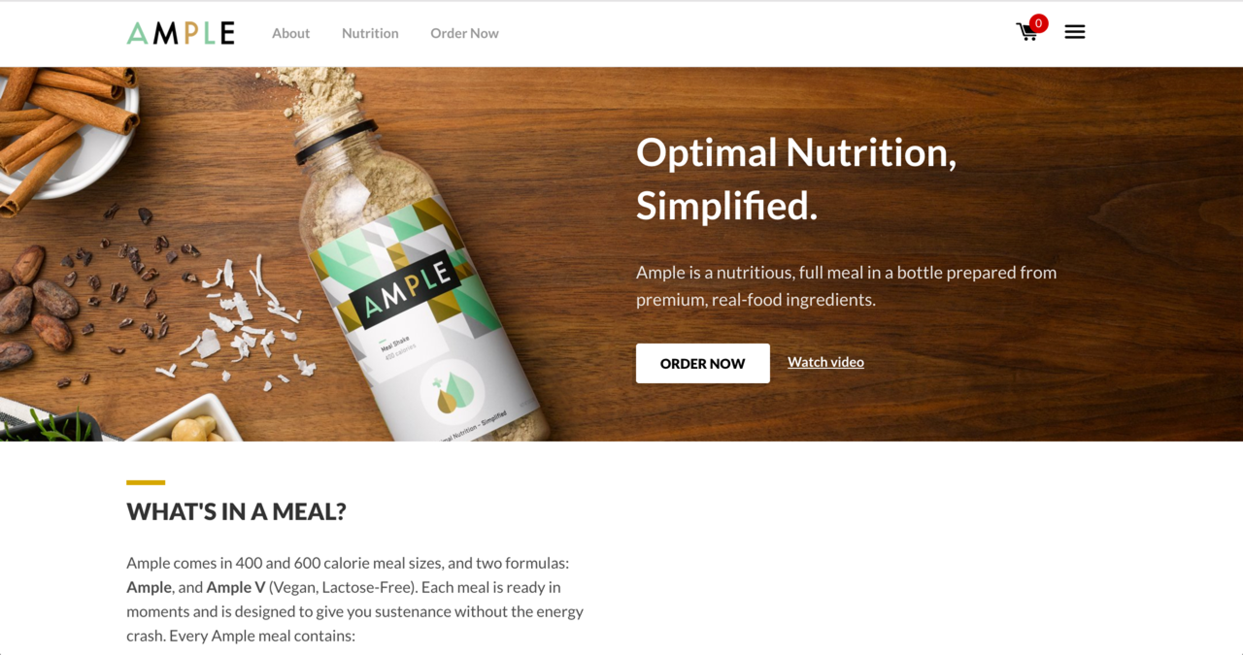
Because Ample is a physical product, any rebranding or change of colors would have been time-consuming, expensive, and difficult to roll out all at once. Rather than subject any early-stage startup to that, I decided to extend the bottle label design to the web.
I worked with a similar palette of colors and patterns so the web and physical product experience would be cohesive, and added new illustrations or hues when I needed them.
Landing Page ‧ View Before
Product Page Improvements
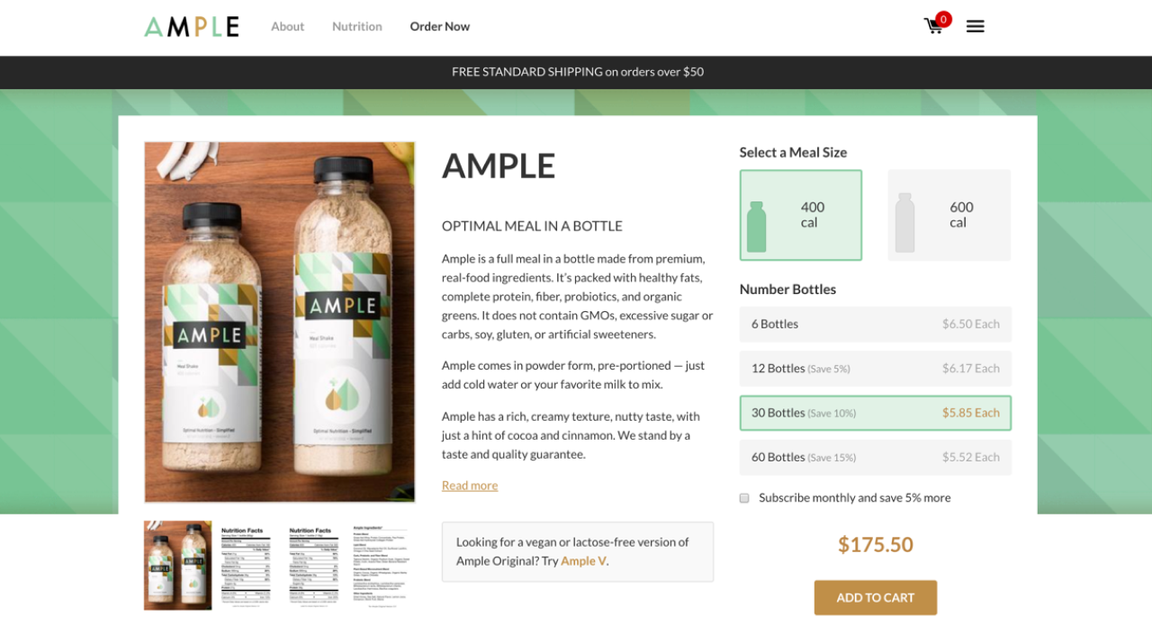
After people landed on Ample's website, the next step was often the product page. For brevity, I changed these things (you can look at the before/afters if you're curious).
- Made all thumbnails have a consistent aspect ratio
- Removed “Order Now” CTA from header (you’re already there!)
- Switched from a 2-col to 3-col layout to bump "Add to Cart" above the fold
- Showed two bottle sizes in the product thumbnail because customers didn't always know it came in multiple sizes
- Changed the order options from dropdowns to buttons
- Added a banner highlighting free shipping
Product Page ‧ View Before
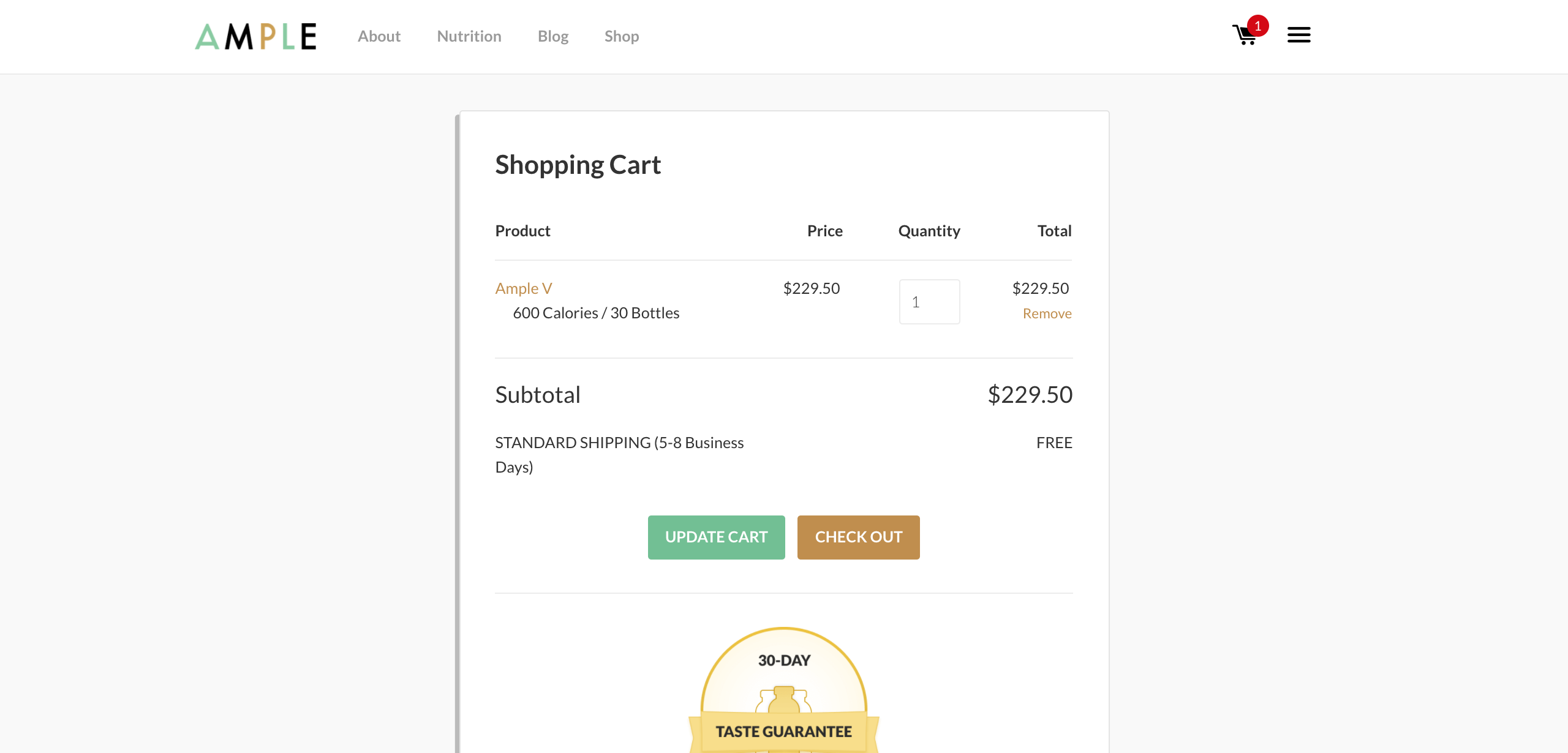
Cart Page Improvements
- Narrowed the width to make it easier to scan
- Moved the checkout button higher
- Added free shipping as a line item
- Designed and added a 30-day taste guarantee
Cart Page ‧ View Before
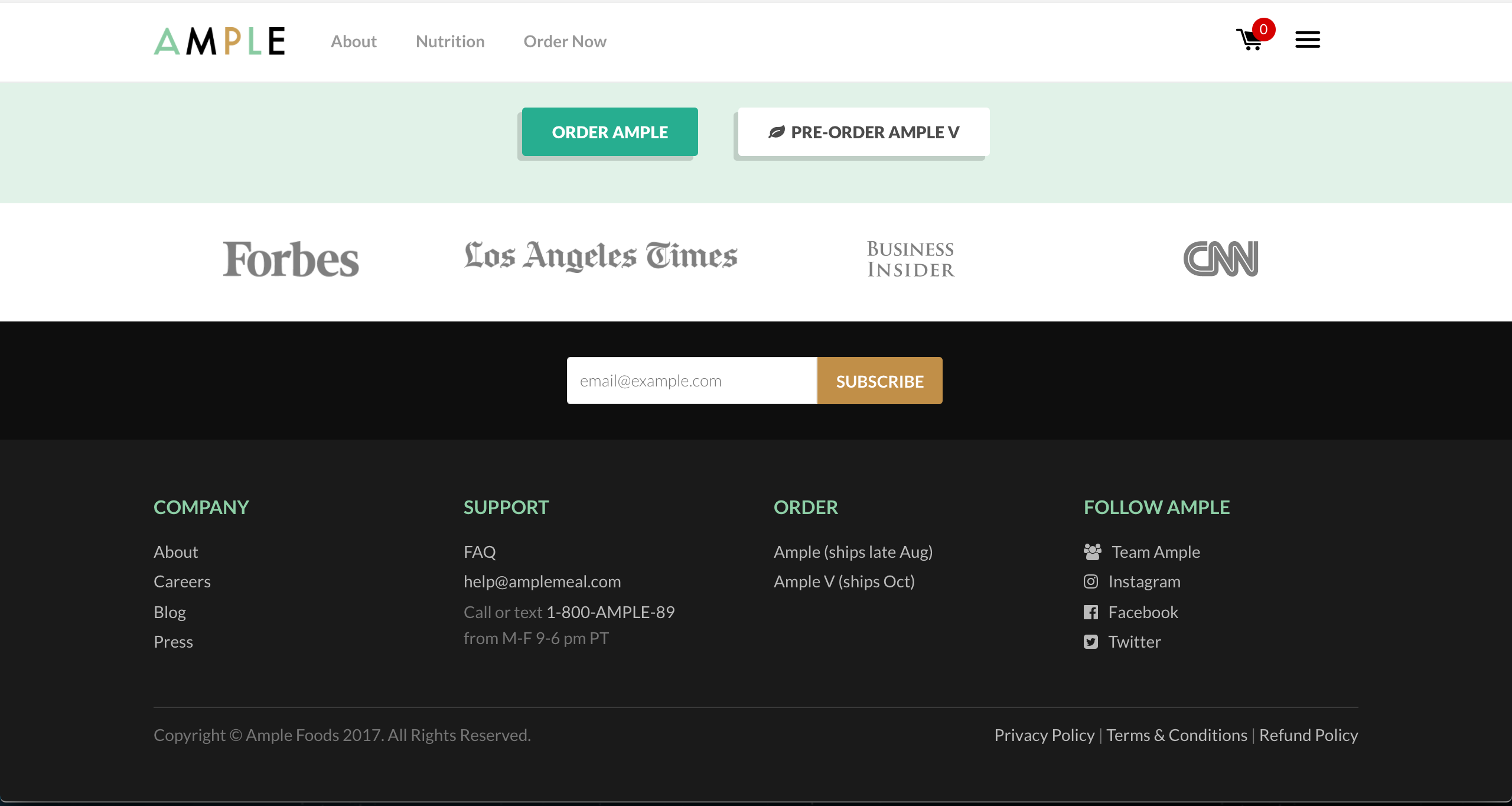
And because I love me a good footer, I'm including that, too.
Footer ‧ View Before
Improving Customer Education
Based on feedback from user discussions in our forum and insights from our in-house customer support teammates, we realized the way customers got educated and got onboarded could be improved.
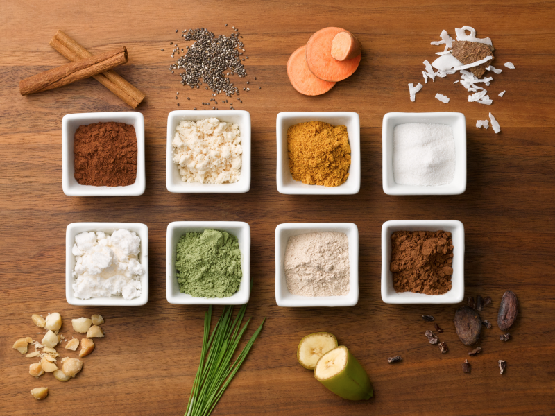
Naturally, if you're about to replace one or more of your meals with a bottle full of powder that costs $5-7 (which was 3x Soylent's price at the time), you may be hesitant to purchase it, and once you have, you may not know the best way to consume it.
Things users cared about:
- The taste
- Ample's ingredients
- Ample's macronutrient composition
- Whether or not Ample was lactose-free, gluten-free, vegetarian, vegan, etc.
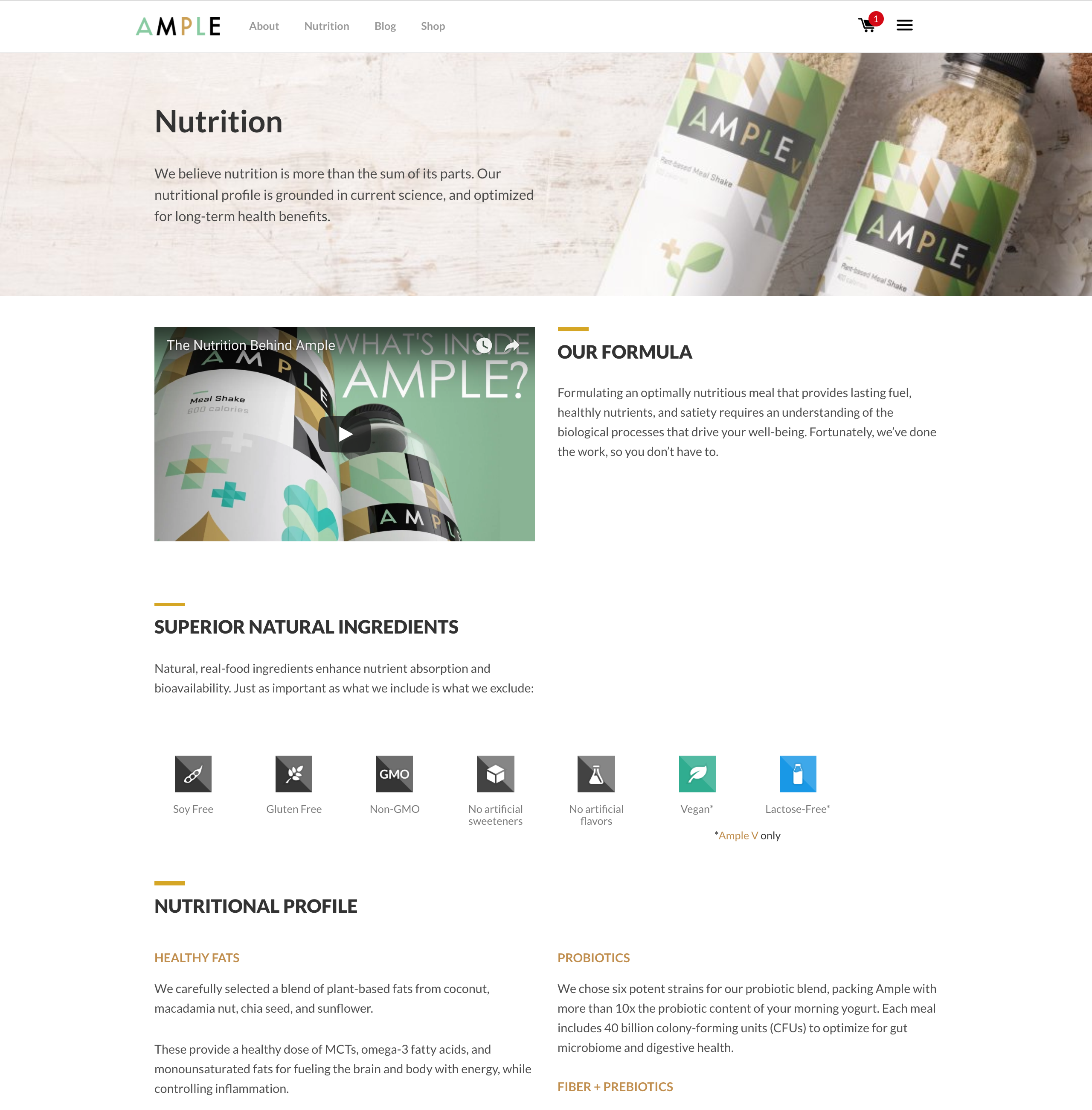
Recognizing that the lack of nutrition and allergen information might cause friction to potential customers, we created "Nutrition" as a top level page. This allowed people to research before buying. As an additional win, all that information used to be on the product page, which was now cleaner and loaded faster.
Nutrition Page ‧ View Before
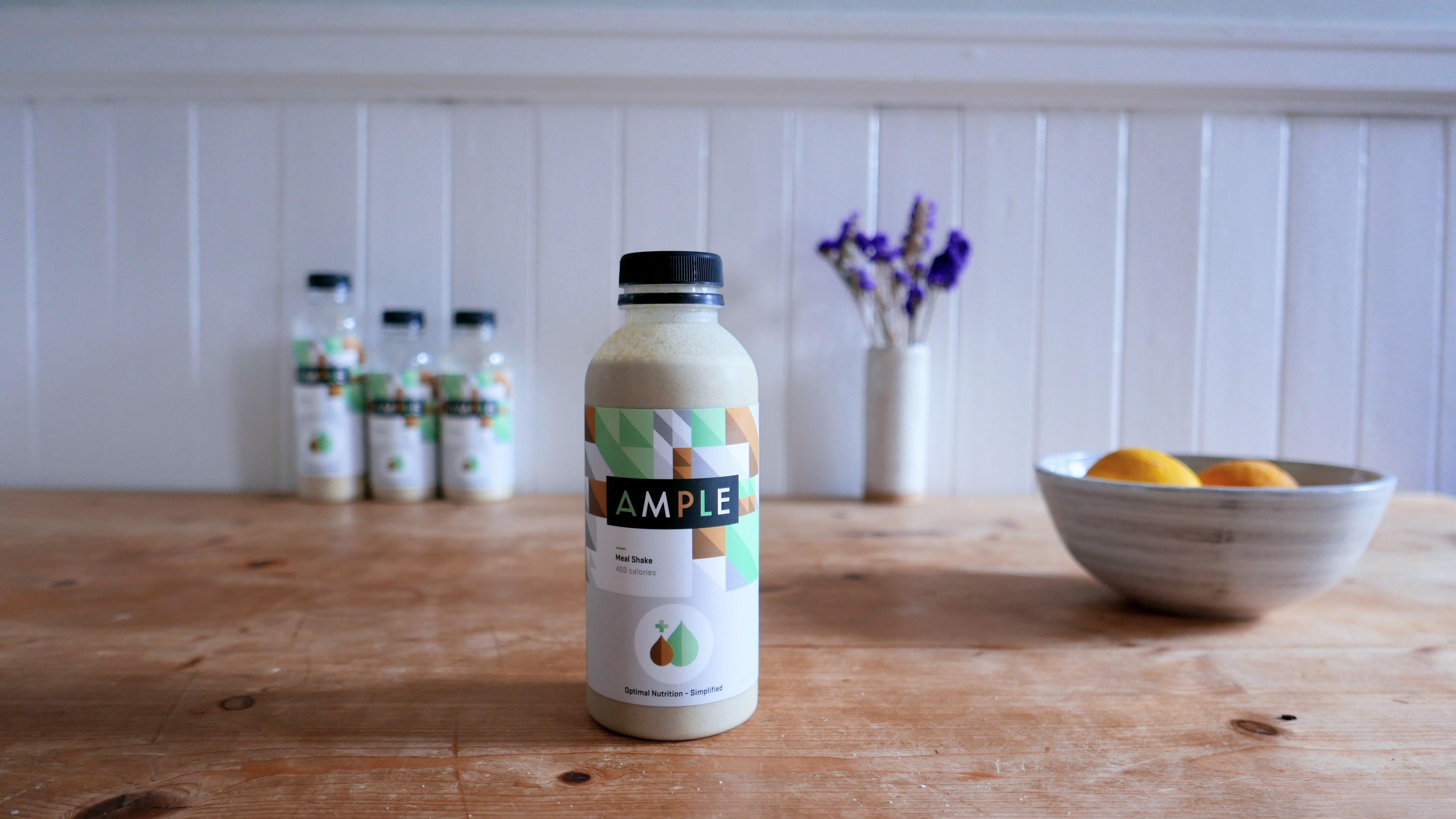
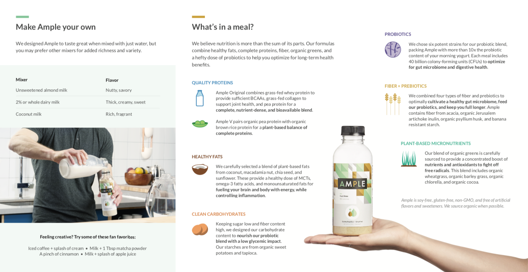
Once someone purchased a bottle of Ample, between then and when it arrived, there wasn't much guidance for how the product could be consumed. The label said to mix it with water, for example, but many customers preferred mixing it with milk. Others preferred the thicker consistency from leaving it in the fridge for 15 minutes.
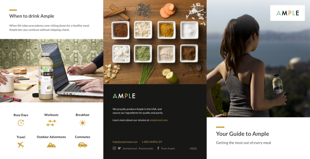
To help address customer service volume and reduce returns of the product due to taste reasons, I designed a brochure to better inform and onboard customers.
The tri-fold went in all Ample shipments, and described tips and tricks for mixing the product, and ideas for where/when it could be consumed.
Onboarding Brochure (front and back covers, inner flap)
Onboarding Brochure (inner pages)
Packaging
Last but not least, I had the opportunity to do some packaging work for Ample before I moved.
Box Designs
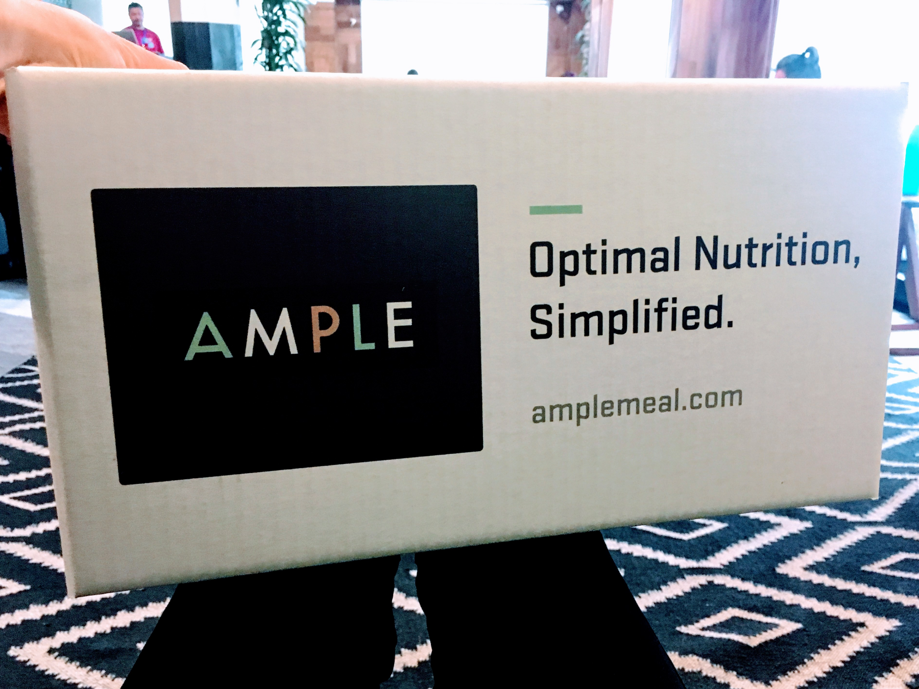
Ample shipments came in packages of 6, 12, and 30 bottles. Since we weren't printing locally, we had to wait for versions to get shipped before making iterations. I'm holding one of the early test prints that was sent to the office on my lap in the photo below.
Box Test Print!
Here is another version of the 30-bottle box design:
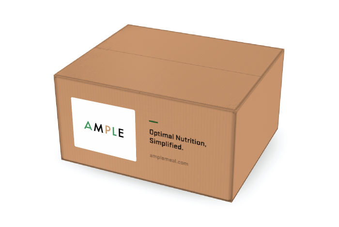
Here's what they looked like in the end (though this is one of the smaller sizes):
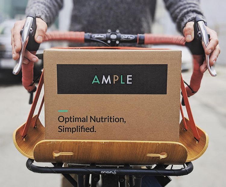
Multipack Design
I also designed a 6-bottle multipack holder. Ample was previously sent as loose bottles in each large box, so this helped keep them a bit more organized for both users and in warehouses when orders were fulfilled.
Ample Multipack Design
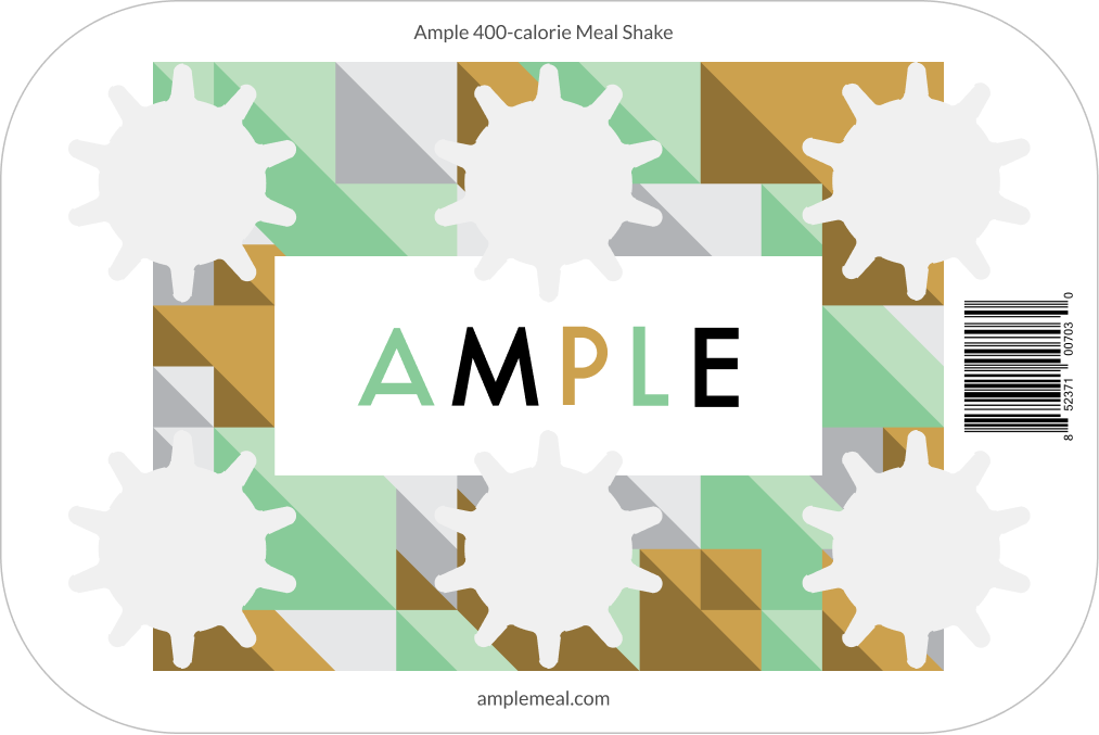
It's a modification on Ryan Bosse's original Ample label design, which uses a repeating pattern of squares and triangles with the logo overlaid on top.
Test Prints
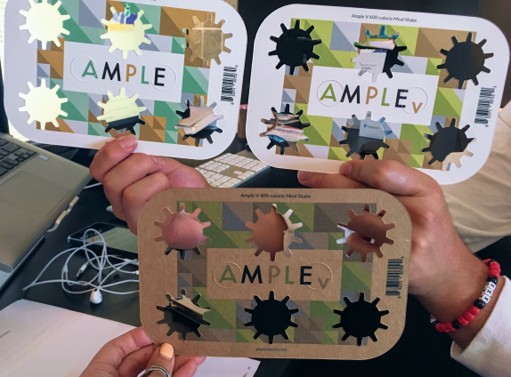
Final Prints
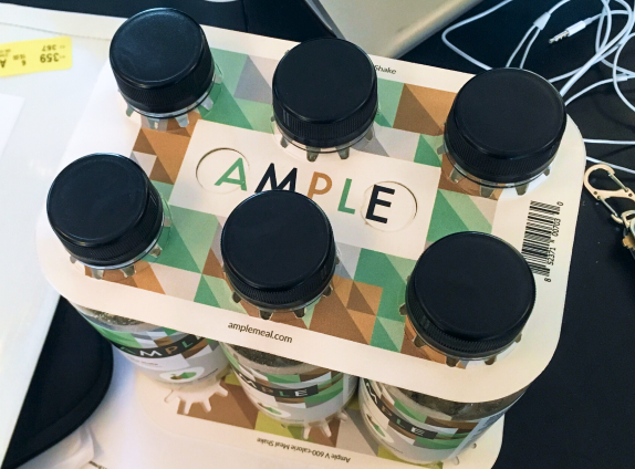
Thanks for reading all the way to the end! If you are curious what Ample tastes like after reading all this, check them out :)
